
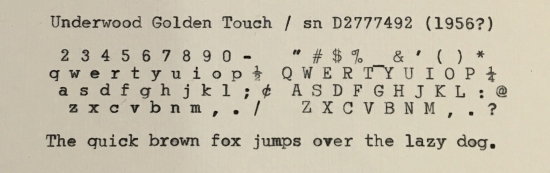
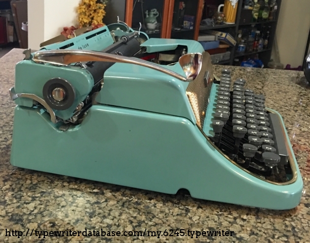
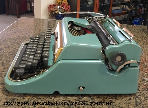
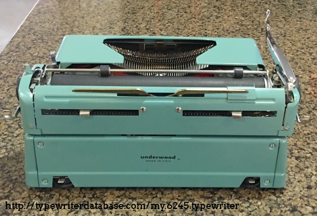
1956 Underwood De Luxe #D2777492
Status: My Collection
Hunter: Dan Johnson (rdj)
Created: 06-02-2016 at 01:50PM
Last Edit: 09-06-2016 at 06:10PM

Description:
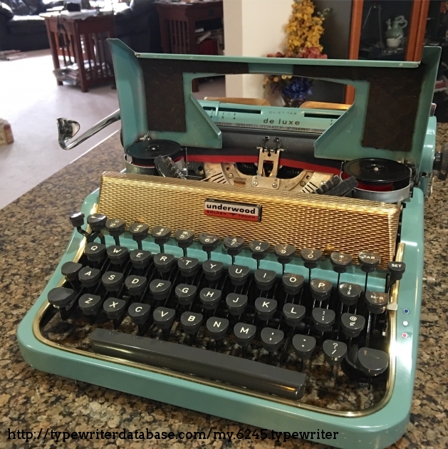
(This is a "Golden Touch" De Luxe Quiet Tab.)
Some people hold portable Underwood typewriters of the 1950s in lower regard than their predecessors, whether that is due to a decrease in inherent operational quality or a decline in fit and finish. In the serial number database, their diverse product lines seem to end with the close of that decade during which they seemed to return to the more "flashy" designs and colors of their earlier years.
It is amusing to conjecture whether that was the "last gasp" of their company trying to increase their share of the market or to make themselves more attractive to another company seeking to merge with them. (Evidently, Olivetti bought Underwood in the early 1960s, subsuming rather than perpetuating or building on what Underwood had done.)
Collectors do not value these machines as strongly or develop the same degreee of loyalty as they seem to do for the Royals, Olympias, and Hermes portables. Perhaps Underwoods and Sterlings were targeted at a larger market, people who were unwilling to pay more for higher quality. They may have been fine machines (or fine enough) when new and used so much that they wore out or whatever weaknesses they had became more evident. I do not have enough experience with them to judge the likelihood of these hypotheses.
What I do know is that this Underwood "Golden Touch" Deluxe Quiet Tab typewriter is in really good shape! It does have a few rough spots – the carriage release levers behind the platen knobs seem a bit flimsy, and the margin setting controls are cheaply constructed, but it compensates with its handsome appearance – which approaches but does not quite enter into chintzy territory. It also offers a pleasurable typing experience: this machine seems almost as good, to me, in that regard as a Royal QDL.
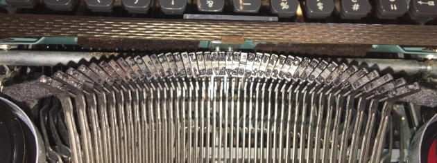
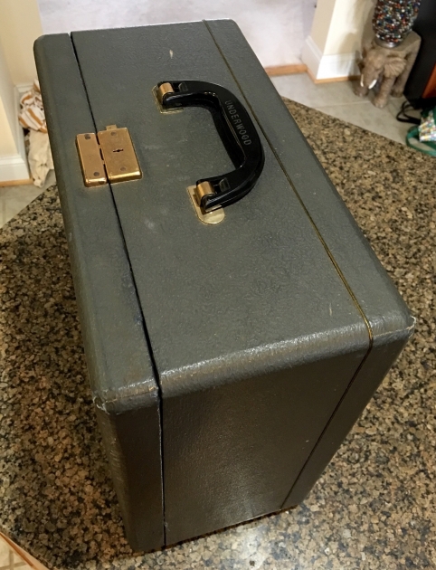
The other thing about this machine is its typeface. That is not what originally attracted me to it, but it did end up prompting my posting this into the Typewriter Database. I purchased this machine a full two years ago and was delighted with its condition. As you can see in the pictures, it's in great shape cosmetically. I never did clean it as I routinely do on arrival of a new machine: this is how I received it back then. For various reasons, I used it for a while, and then it ended up back in its case along with the rest of the machines, patiently awaiting attention to be bestowed upon them again.
The other day, there was an auction for one of these with the same color scheme, in visibly comparable shape, and at a reasonable, "Buy It Now" price. What caught my eye was the typing sample the seller had included among the pictures. It looked so cool! Briefly, I considered going ahead and buying it and then selling off the older one, but first, I pulled the one I had out of its case and took a closer look at it. It has the same typeface.
What I appreciate about this typeface is that it is simple and clean yet with some unusual, whimsical characteristics: the oversized loops on round lowercase characters, the way the R's descender makes it look like it's kneeling slightly, the "nubs" on the "2" and "3", the 90º corner at the base of the "t", and the square period.
I couldn't dig up much about this typeface but did find a few reviews from trusted sources by people who were also impressed by it. "Machines of Loving Grace" described it aptly as a "new geometric slab serif typeface--apparently based upon Memphis--that is more modern and artistic while still being professional enough for business use". Richard Polt marveled at the "square period" and the large loops on lowercase characters, noted the slanted apostrophe and quotes, and that this was one of the few typewriters that differentiated betwen the appearance of the zero and uppercase "O".
So, here it is, and here I am, falling in love with this handsome typewriter all over again.
Typeface Specimen:
Links:
Photos:
Hunter: Dan Johnson (rdj)
Dan Johnson's Typewriter Galleries [ My Collection ] [ My Sightings ]
Status: Typewriter Hunter
Points: 948
I have always loved typewriters along with other kinds of well-engineered tools and devices such as slide rules, calculators (particular HP), radios, cameras (particularly Nikons), and microscopes. In addition to appreciating their intrinsic beauty and utility, they represent "things that need to be figured out to be understood". That's how I first learned about computers and programming in the 1970s, by figuring things out for myself. It's activity in which I never seem to tire of engaging.
Although communities have arisen around other collection interests, typewriters have the advantage that those who use them also typically enjoy communicating through words, whether those words are about the machines themselves or their lives, hopes, dreams, or expressions of beauty. There's much to be appreciated here.
RESEARCH NOTE: When researching the Underwood De Luxe on a computer with lots of screen real estate, you may find that launching the Underwood Serial Number page and the Underwood De Luxe By Model/Year/Serial page in new browser windows can give you interesting perspectives on changes throughout the model series.